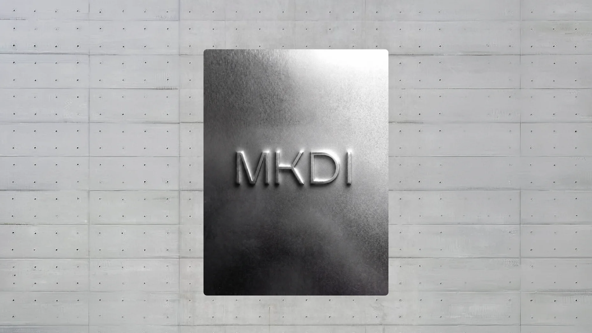
Makadi
Visual identity and brand strategy for a Mexico City studio that designs and builds interiors for contemporary real estate developments.
Project Scope
Brand Concept | Naming | Visual Identity | Brand Voice | Brand Applications | Social Media
Makadi’s identity was built around the idea of structure: a brand where design, technical expertise and industrial precision work as one. Every element was developed to communicate reliability, scale and a deep understanding of contemporary architectural projects.
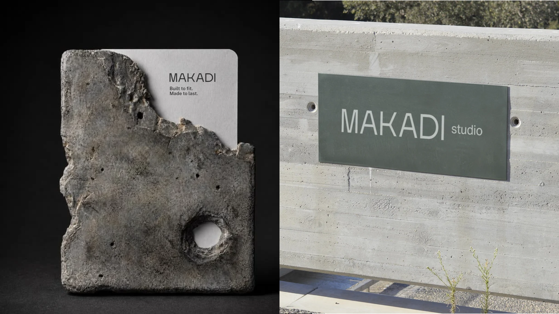
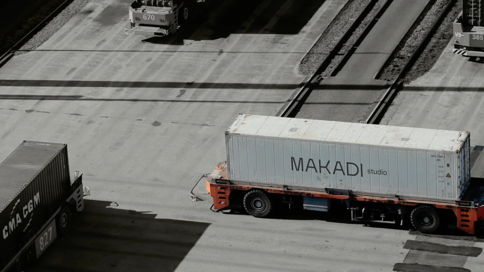
BUILD WITH PURPOSE. DESIGNED WITH PERCISION.
The name and wordmark follow the same logic. Makadi condenses into MKDI — a compact, modular monogram that works like a construction mark: stamped on materials, printed on containers and signage, and legible at any scale.
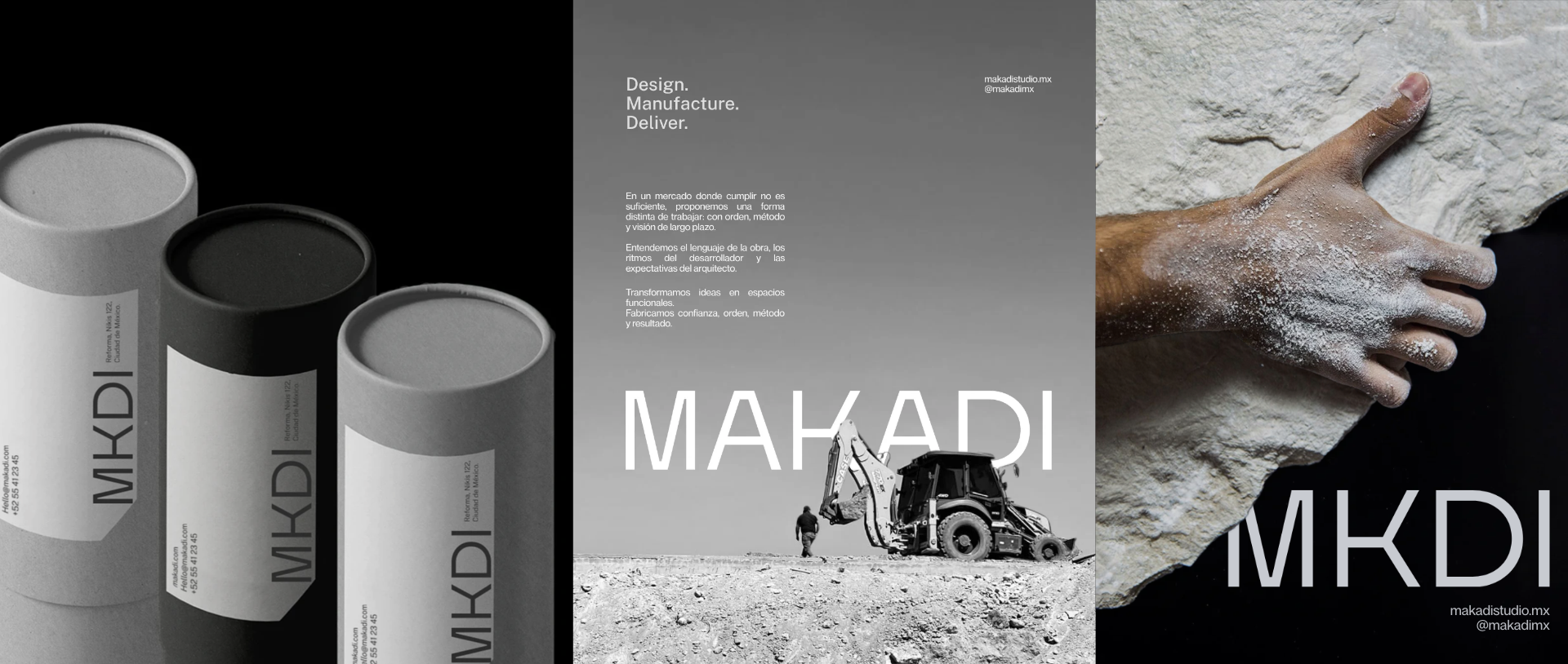
A SYSTEM MADE TO PERFORM.
The visual universe takes inspiration from architecture, raw materials and manufacturing processes. Concrete, metal, geometry and negative space shape a restrained aesthetic that feels technical yet sophisticated — reflecting Makadi’s ability to turn complex plans into precise solutions.
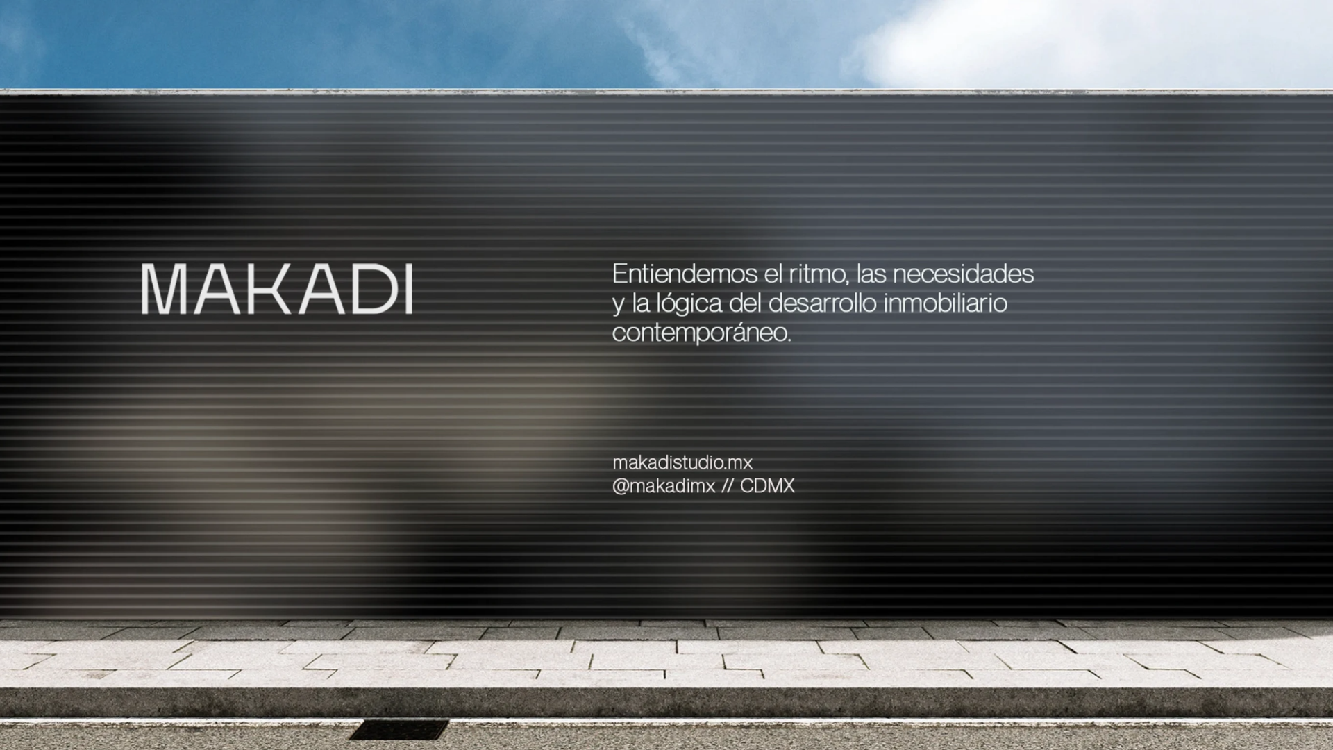
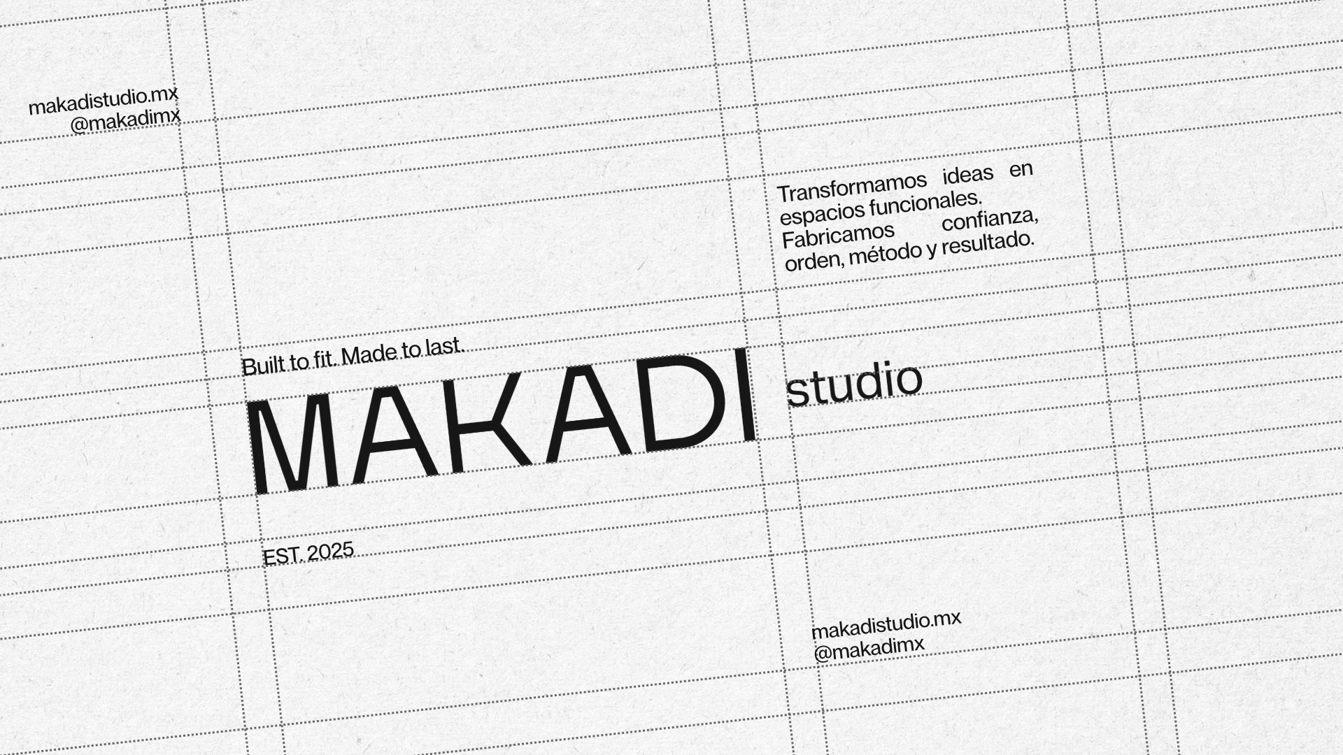
Rather than creating isolated graphic elements, we developed a flexible identity system built to adapt across different applications and scales. Clean compositions, strong proportions and intentional simplicity give the brand a consistent and recognizable presence.
Makadi’s art direction focuses on the beauty of construction itself. Architectural volumes, material textures, light and shadow become visual protagonists, creating imagery that feels honest, monumental and refined without relying on unnecessary decoration.