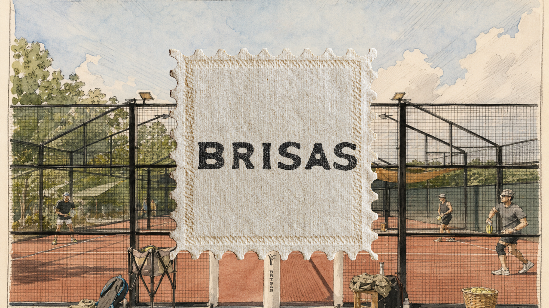
Brisas Padel
Visual identity and brand strategy for a contemporary padel brand that brings Acapulco's effortless luxury to the Hamptons.
Project Scope
Brand Concept | Visual Identity | Brand Voice | Brand Applications
Brisas is inspired by the birthplace of padel: Acapulco. Created for the Hamptons, the brand pays tribute to Las Brisas, capturing the effortless luxury, warmth, and relaxed lifestyle that define its identity.



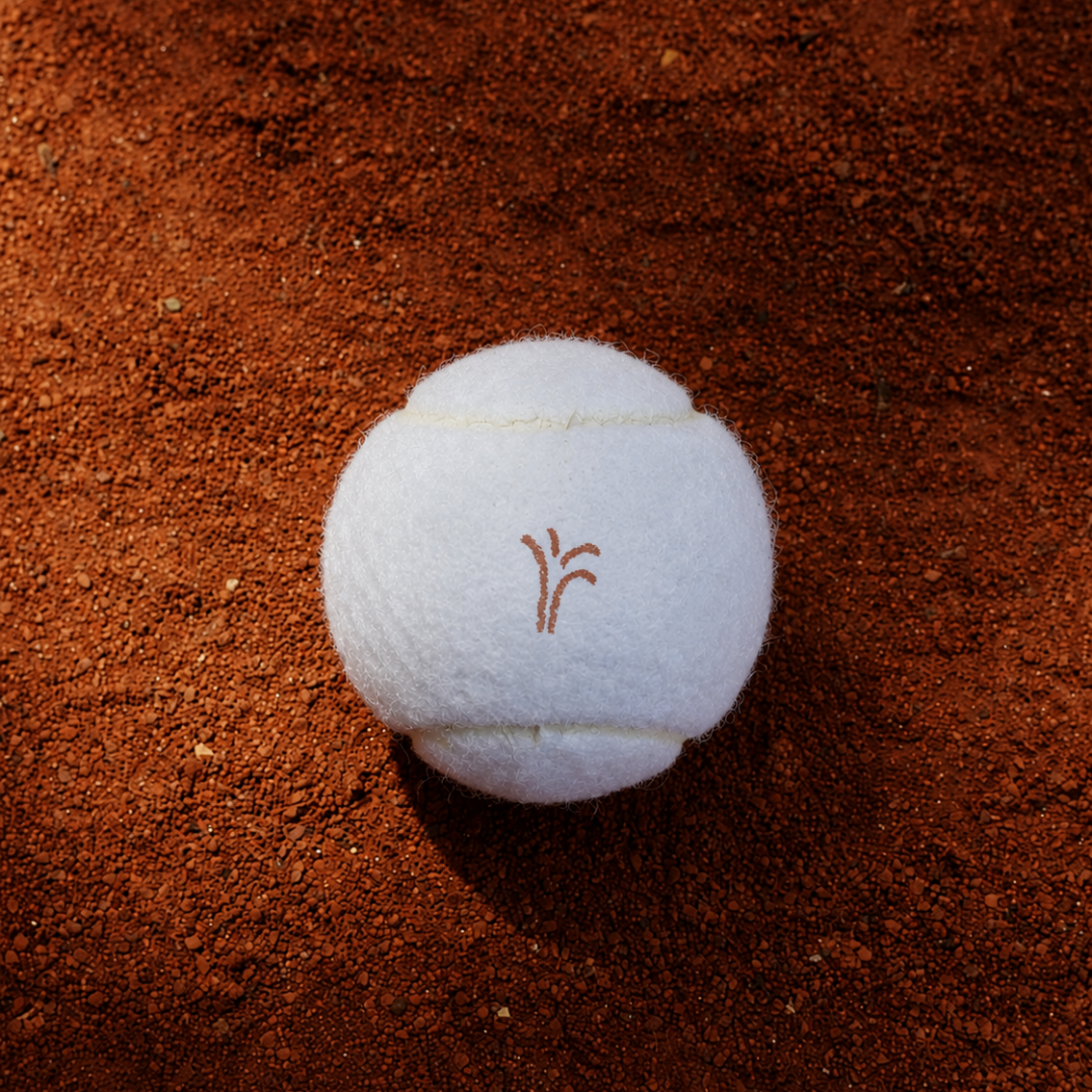
The visual language blends earthy tones, handcrafted textures, editorial photography, and timeless typography.
Every element was designed to create a brand that feels authentic, elevated, and deeply connected to its origins.
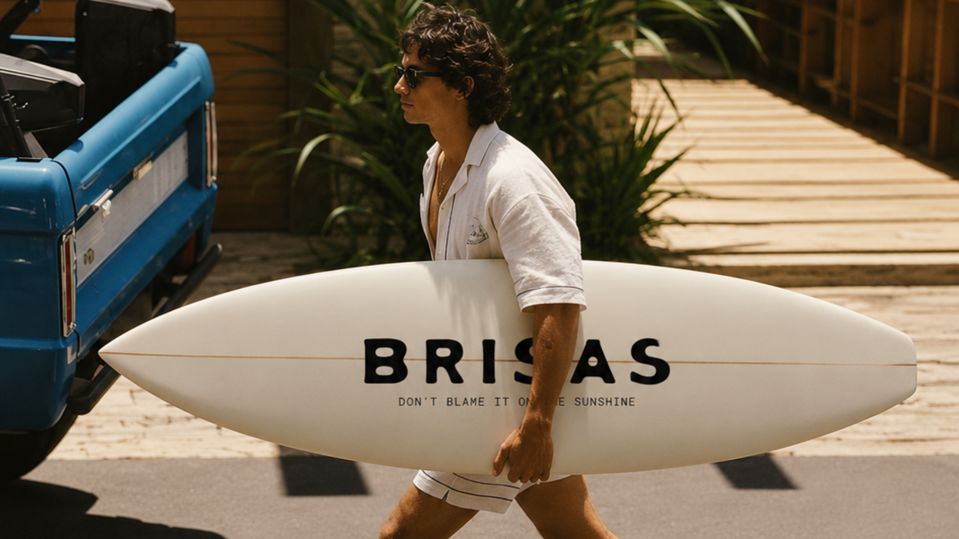
The identity was built as a complete visual system, exploring color, typography, iconography, layouts, and brand applications. Each decision was made to ensure consistency across every touchpoint while preserving a strong sense of place.
From logo lockups to court signage and apparel, each application was crafted to feel cohesive yet alive — carrying the same warmth and craftsmanship across every surface the brand touches.
On the court and off it, Brisas carries the same relaxed confidence — a color and texture story built to feel as natural in the Hamptons as it does on the shores of Acapulco.
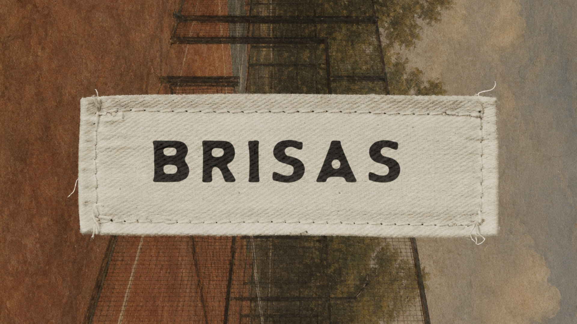
Every touchpoint, from packaging to social presence, was designed to hold up to close inspection — a brand built for people who notice the details.
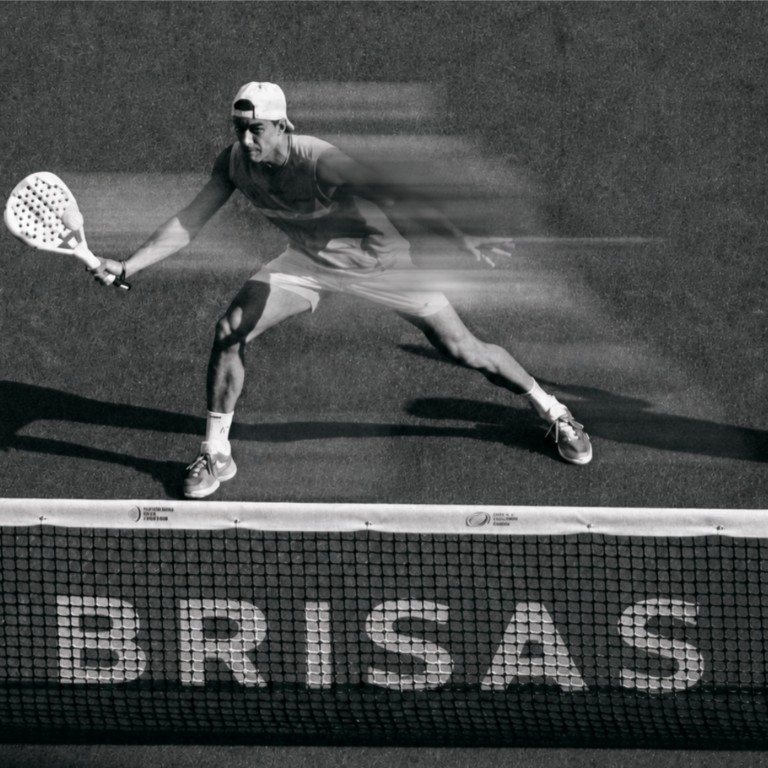
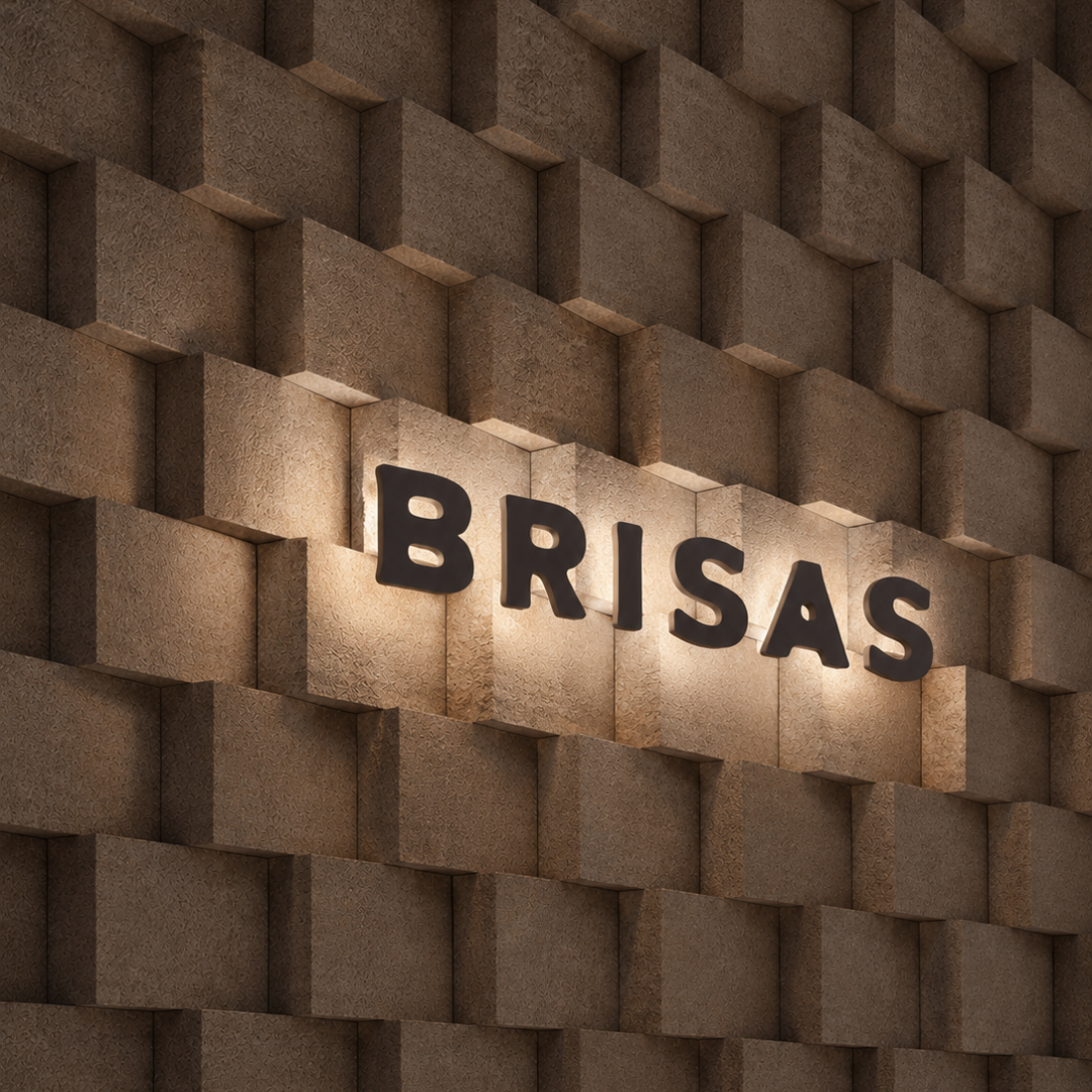
Brisas became more than a padel brand—it became a lifestyle identity. A timeless visual system that celebrates the heritage of the sport while connecting with a modern, international audience.
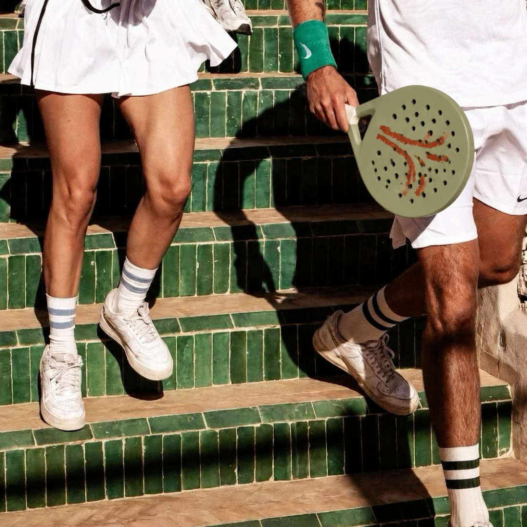
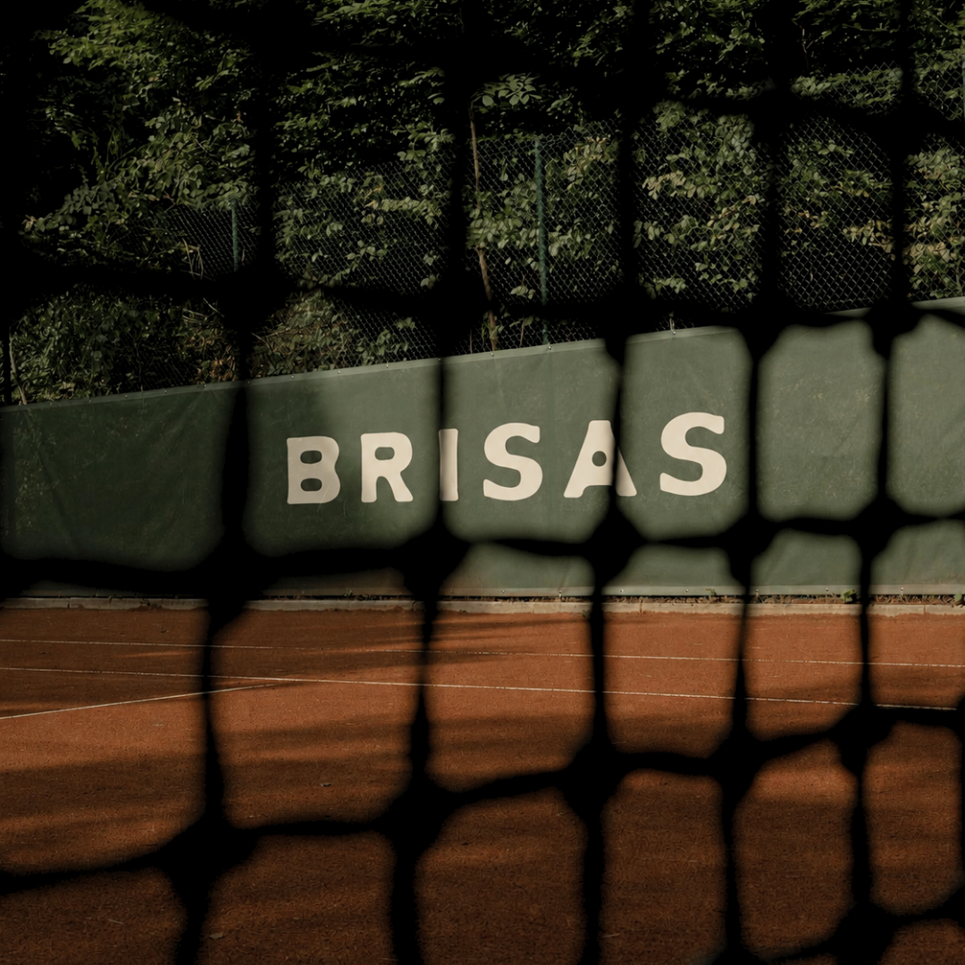
Brisas became more than a padel brand—it became a lifestyle identity. A timeless visual system that celebrates the heritage of the sport while connecting with a modern, international audience.