Spill That
Visual identity and brand strategy for a contemporary laundry detergent brand rooted in minimalism and elevated home rituals.
Project Scope
Brand Concept | Visual Identity | Brand Voice | Brand Applications | Packaging
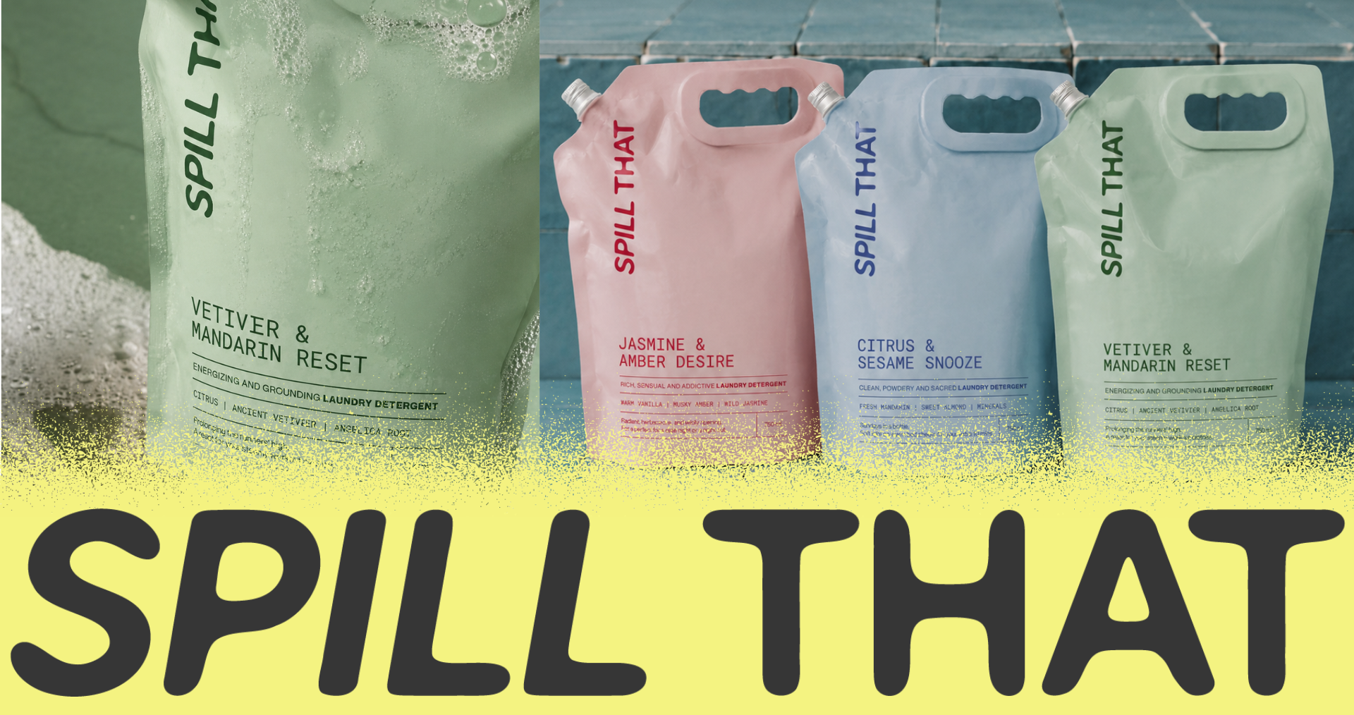
Spill That was created to challenge everything we associate with laundry. Instead of loud colors, busy graphics, and clinical messaging, the brand embraces a refined visual language inspired by luxury fragrance and contemporary design.
Every element was intentionally stripped back to let the product—and the ritual—take center stage.
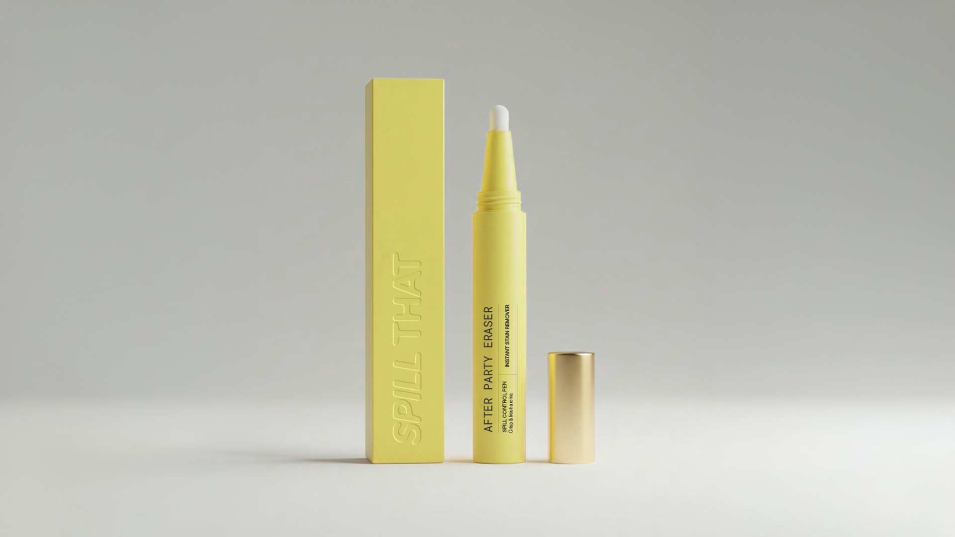
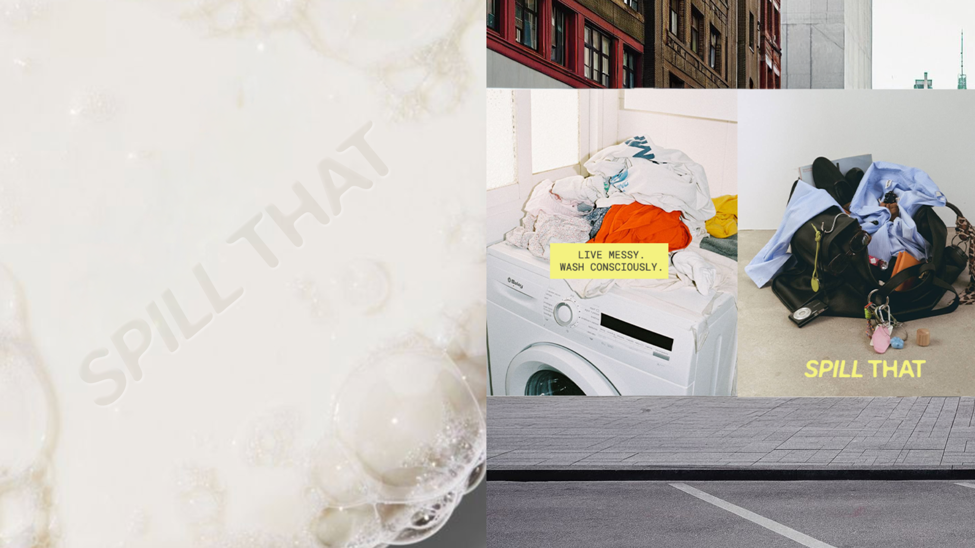
The visual identity was designed to break away from the traditional detergent aisle. Rather than communicating utility first, Spill That communicates emotion, aesthetics, and lifestyle, positioning laundry as an experience instead of a household task.
The brand language is rooted in minimalism.
Soft color palettes, generous negative space, and modern typography create a timeless identity that feels closer to skincare or fine fragrance than conventional home care products.

Every visual decision revolves around scent. The packaging, photography, and creative direction were developed to express emotion rather than cleanliness alone, allowing each fragrance to tell its own story through color, texture, and atmosphere.

Spill That rejects the idea that detergent belongs hidden inside a cabinet. The packaging was conceived as an object worth displaying—a product designed to live naturally within thoughtfully curated homes and modern interiors.
More than creating a detergent brand, the goal was to build a lifestyle. The visual identity reflects a community that values intentional living, elevated rituals, and products that seamlessly blend beauty with functionality.

At its core, Spill That celebrates the imperfections of everyday life. The identity embraces the idea that stains are evidence of experiences, memories, and moments worth remembering. Rather than erasing life, the brand gives it a beautiful place to belong.